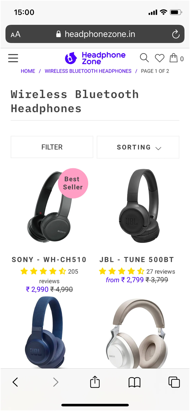
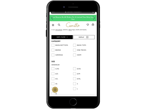
Due to the prevalence of smartphones and tablets, mobile commerce, or M-commerce, is on the rise and has seen a number of noteworthy trends. In fact, 65% of all e-commerce traffic in 2019 came from those small-screen devices, far outpacing desktop traffic.
Mobile sales are also falling behind despite drawing a sizable amount of traffic. Client data from SaleCycle shows that mobile expenditure is $73 less than desktop spending for the past two years in a row.
Why are Mobile Sales Down When M-Commerce is Growing?
The Baymard Institute conducted a thorough investigation on mobile e-commerce to identify the challenges and the primary issue, which is product discovery.
Shoppers won’t proceed to payment until they can easily find the proper item. You can use the helpful advice in this article to improve site search and filter systems.
Now without further ado, let’s begin!

When Building a Mobile-Friendly Site Search and Product Filter, Take into Account these 3 Mobile Characteristics.
Screen Size
The small size of mobile devices poses the biggest challenge when converting Shopify search bar and filtering functionality from the desktop to the handheld device. It will never work to simply scale the elements of a desktop design for a mobile device.
Customers behave differently on mobile devices, thus mobile optimization requires rethinking how your site’s search and product filter appear and function.
Virtual Keyboards
Mobile users frequently use the virtual keyboard on the screen of smartphones because they typically don’t come with real keyboards. Therefore, instead of using all ten fingers to input the keyword, they will typically use just two thumbs, which is more prone to typos and results in no products being located.
Additionally, users can conduct searches on their phones in a variety of circumstances, such as while exercising or waiting for a bus. The practice of multitasking can also result in spelling errors.
To make clients’ product search chores easier, you should therefore prepare your website searches for both misspellings and suggestions.
Internet Connectivity Issues
Customers frequently browse the internet via mobile data since they always have their phones with them. The 3G/4G or 5G networks, however, are not reliable.
Even though cellular network providers claim to offer lightning-fast speeds, the maximum capacity is dependent on the providers’ coverage and the data plans that users choose to purchase.
When creating a mobile search and Shopify filter, you must consider the possibility that users will occasionally run out of mobile data or have an interruption in their internet connection.
Best Principles for UI/UX in Mobile Site Search
The search bar works well with the navigation menu as an aid for online buyers. More significantly, numerous studies show that searchers convert at a considerably higher rate than casual browsers. As a result, improving mobile site search can significantly increase your sales.
Let’s start by examining the mobile search bar’s user interface (UI) design.
Site-Wide Pattern Search Field
Make anything stand out if you want customers to pay attention to it. Because of this, full-length search fields are frequently used in e-commerce designs optimized for mobile.
When viewed on a mobile device, search is typically located at the top of the page, just like its desktop equivalent, so users can see it right away. Add a few sentences of placeholder text with conversational remarks to encourage people to look around.
Along with the full-length search bar, a lot of M-commerce websites have a habit of hiding the search option behind the magnifying glass icon in the site-wide menu.
You may access the search field by touching this icon. Tap once more to reveal it. Although this design is used by 35% of mobile websites tested by Baymard, there is a significant trade-off because the majority of users mistake the magnifying glass icon for a search submit button.
Search Box Layout
You should choose a white background color for the search field and a thin border with low opacity to make the search bar stand out while still blending in with the overall design.
Another highlight in a darker tone can be the magnifying glass icon. The “submit” button, which is crucial to the M-commerce UX, can also be combined with the search icon.
Baymard discovered during a mobile usability test that customers would rather use a search submission button than a touch keyboard to enter their search terms.
Sort and Filter Independently
In many situations, sorting is much more beneficial than filtering.
Use pricing as an illustration. To make the required items available to price-conscious buyers, sorting by price from low to high requires fewer steps.
These consumers will need to go through a few extra steps, such as opening the filter and scrolling down to the “Sort by” options, in order to receive the product list in their desired order if sorting is combined with the collapsible filter tree.

Up to Top Button
Filter and Sort are by default compressed and positioned at the top of the product list.
The user experience can be improved by using a pinned filter so that users don’t have to scroll up to change their filter settings. However, it occupies the area designated for product display.
You can choose a “up to top” button, like the upward arrow on the mobile edition of Northern Brewer in the middle of the above image.
Layout of the Filter Option List in Two Columns
The use of a 2-column display for the filter options can improve the organization and efficiency of the collapsible filter tree. Customers find it frustrating to have to browse endlessly through a big, one-column list in order to reach the desired option.

Avoid Using Mobile Devices’ Native Interfaces
Last but not least, don’t rely on native UI.
The mobile device’s default design has many flaws and isn’t compatible with the overall aesthetic, making it unsuitable for mobile commerce or promoting your brand.
Before you Leave
Site search and filtering have a significant impact on e-commerce conversion rates. As a result, both must be prepared for mobile shoppers, a rising market.
Customers will be more satisfied and more likely to convert when locating products on mobile devices is convenient. Use the advice above to increase mobile sales for your e-commerce business.
If you are using Shopify, our Shopify collection filter and search will help you optimize your mobile layout filter & search bar with just a few clicks. Let’s try

